
Recently, a lot of designers were opening up slots on Calendly for portfolio reviews and I registered for a couple of them to get feedback on my old portfolio. A portfolio that helped me get into an amazing grad school, get hired by multiple clients and secure a full-time job at Parallel - UX Design studio.
After those initial review sessions, I realised a major flaw in my case studies. No one was reading them the way I expected them to read, in detail. Designers were just skimming past it as quickly as possible and that is when I realised that I need to help potential hiring managers read my case studies.


While reviewing my portfolio, designers were getting bored of scrolling over and over again! They were expecting something more from the reading experience on my website.

Since, I had used an HTML template and tweaked it around people it really did not have any personality. Portfolio was missing the humane side of things.

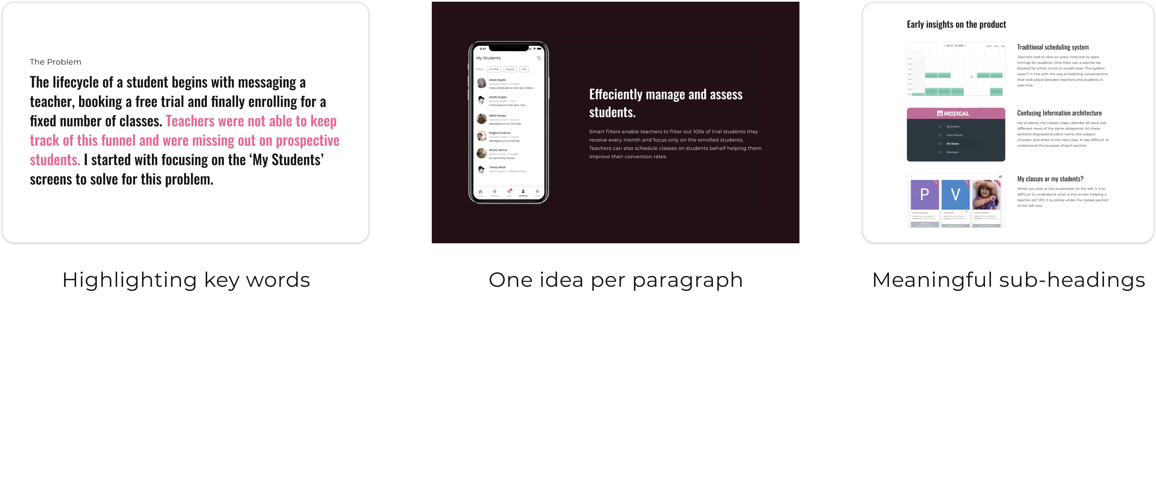
The problem statements were quite wordy. There was no visual representation for helping users digest the content easily.
HMW bring in a sense of personality to the portfolio?
HMW make the case studies more scannable for hiring managers?
Problem #1
This was the most difficult task while designing my portfolio. I wanted to convey myself in the portfolio. It needed to be loud, bold, impactful. Basically, an extrovert - like me :p I started by listing down adjectives that related really well with me and also started looking up design styles that could represent me.


Being an extrovert, I wanted to use bright colors with bold typography to reflect who I am as a designer. I had to make sure that the execution of my vision was precise, dev friendly and adaptable to multiple screen sizes.
Problem #2


.png)

